95º ~ feels like 105º ~ cicadas buzz-humming every day now in the sun
Much has already been written about Claudia Rankine‘s Citizen: An American Lyric. For those unfamiliar, this is a hybrid collection that blurs the line between lyric essay and prose poetry, and includes some stunning visual art as well. (Here’s an example of the poetry.) The subject of the book is race and what it means for Rankine to be a black woman existing in the world today. The essays and poems in these pages work hard to expose what subtle institutional racism looks like from the recipients’ viewpoint, and when not doing that, they tackle head-on racial confrontations in our recent headlines. Combined, the book is a powerful wallop.
I knew most of this before I opened the cover, so I’m not entirely unsurprised by the weight I’m feeling now. Over and over, as I read Rankine’s straight-forward, even blunt, lines, I asked myself: how can one human (or many) treat another this way? And especially, what pushes a person to physically harm another?
I read Rankine’s book and I empathized with her speaker and with the recipients of hate at the heart of her work. And then I wondered: how can we teach this empathy to everyone? What will it take to make people really see each other as precious and alive? At the heart of it, that image of being erased, of being unseen, is the image that stuck with me. Don’t you have to erase someone, to distance yourself from that person, in order to do harm? So, how do we make each other see?
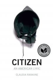
As I read, I also couldn’t help but contemplate the book’s design. I have so many questions for Rankine and John Lucas, who designed the book for Graywolf Press. The cover itself is striking (art by David Hammons: In the Hood, 1993), but I was a bit taken aback by the interior as well. The pages of the book are heavy, 80# matte coated and slicker than regular page weight, even though matte. I understand that the visual art reproduced in the book called for heavier paper and other design considerations, but I was surprised that the press could afford to use that paper throughout the book. It certainly gives the book a stronger “hand feel.” I began to wonder if this weight was consciously planned. A weighty object for weighty subjects.
On a completely side note, I was sad to see the use of a sans serif font for the interior. I know this is the digital age, but I have a really hard time with blocks of text in Arial and the like. The font in Citizen is quite large, so I didn’t have a hard time reading the actual words; I did have a hard time tracking line to line. I suppose this simply makes me a member of the “older generation.” I do wonder if Lucas meant to link the physical text to the digital world where more and more people do their reading.
All of this is to say that if you haven’t yet had a chance to read Citizen, I hope you do so soon. In all my questioning, I am confident that the beginning of an answer can be found in reading each other’s work and attempting to see the world, to feel the world, from another’s body.


